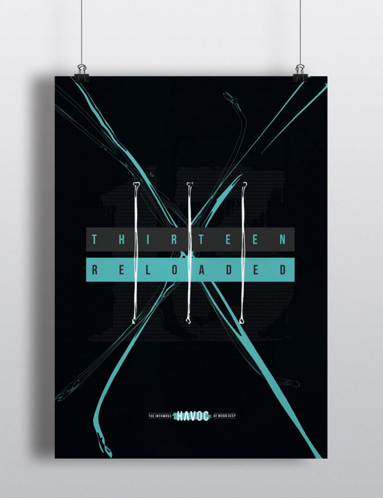
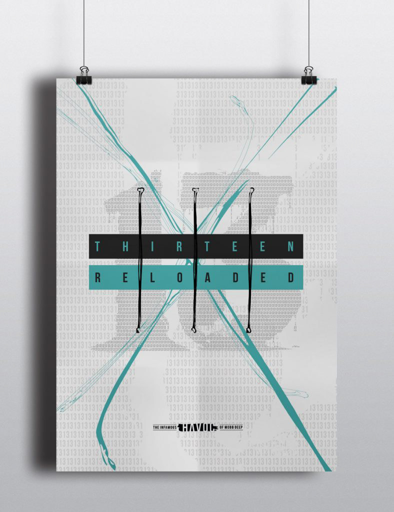
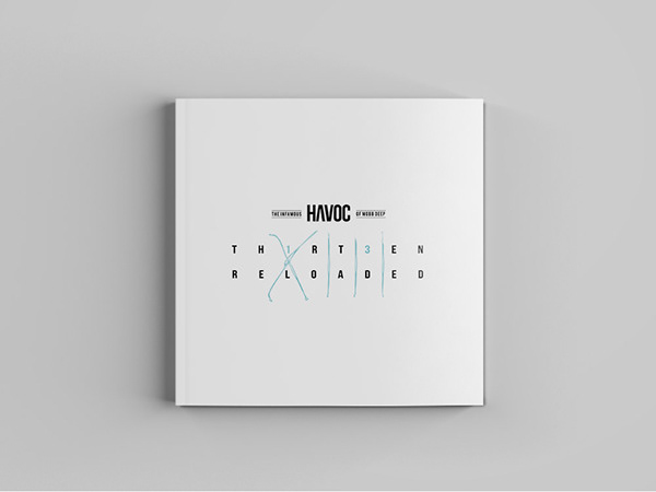
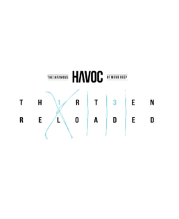
XIII Reloaded
Havoc of Mobb Deep is a cornerstone of hip-hop culture, celebrated for his raw, atmospheric beats and razor-sharp lyricism that have defined the genre’s golden age. This project pays homage to his legacy by reimagining his artistic presence through design. The project explores the intersection of music and visual storytelling, encapsulating Havoc’s gritty, street-inspired aesthetic and the timeless influence of Queensbridge, New York. By integrating album artwork, poster, merchandise, and a producer’s sample bundle design, this project offers a comprehensive branding experience that captures Havoc’s duality as both a legendary MC and a visionary producer.
Year:2014Production:H-Class EntertainmentDuties:Art Direction, Branding, Graphic Design, Photography
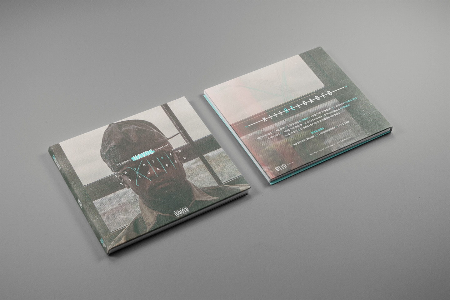
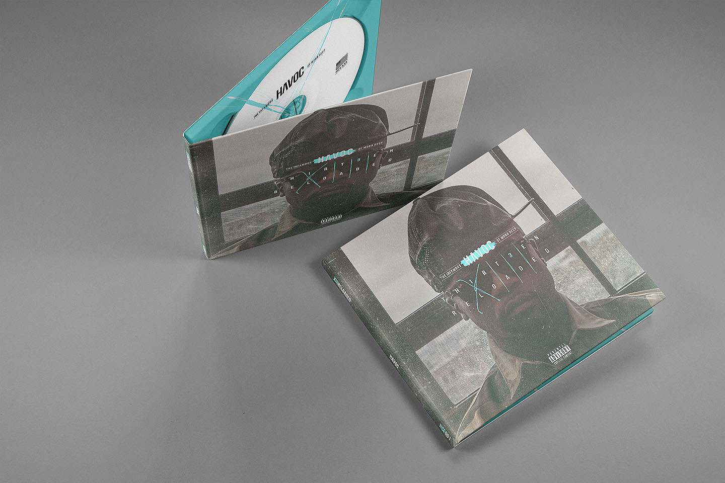
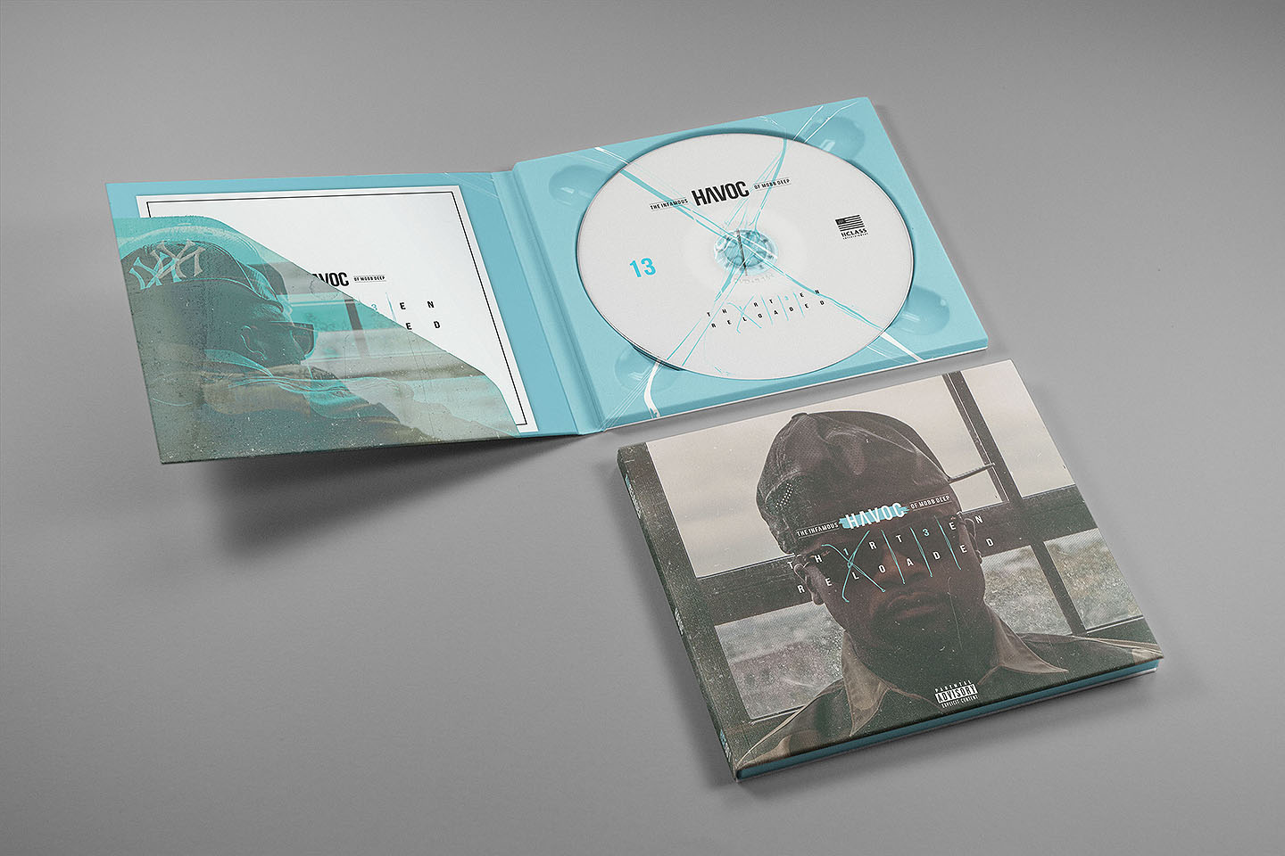
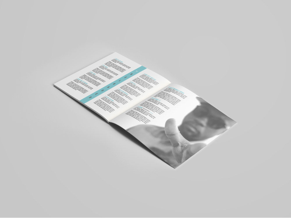
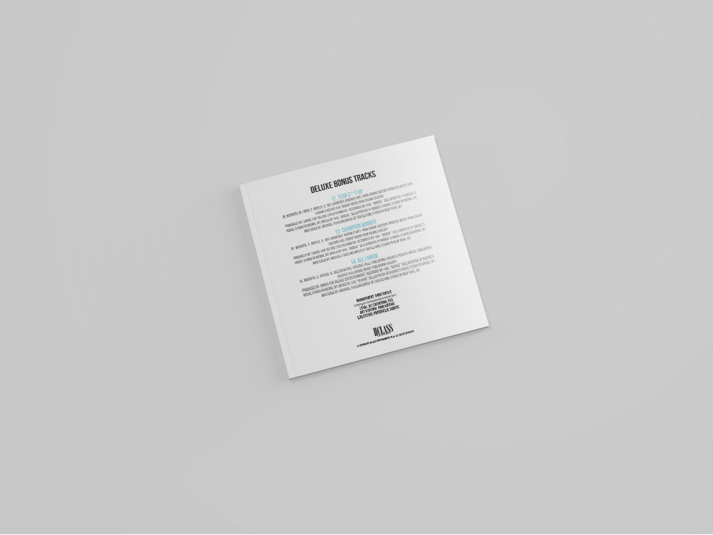
Released in November 18, 2014 by Hclass Entertainment, Inc. “XIII Reloaded” is the fourth solo studio album by American rapper Havoc, one-half of the hip hop duo Mobb Deep. The album features guest appearances from Prodigy, Sheek Louch, Cormega, Ferg Brim & Mysonne. The project serves as Havoc’s fourth solo album, and the 1/2 of Mobb Deep tells us the focus for this album isn’t the rapping, but rather, the production. “Not many guest appearances, it’s all about the production. It’s an album for the fans of Havoc’s sound,” he says.
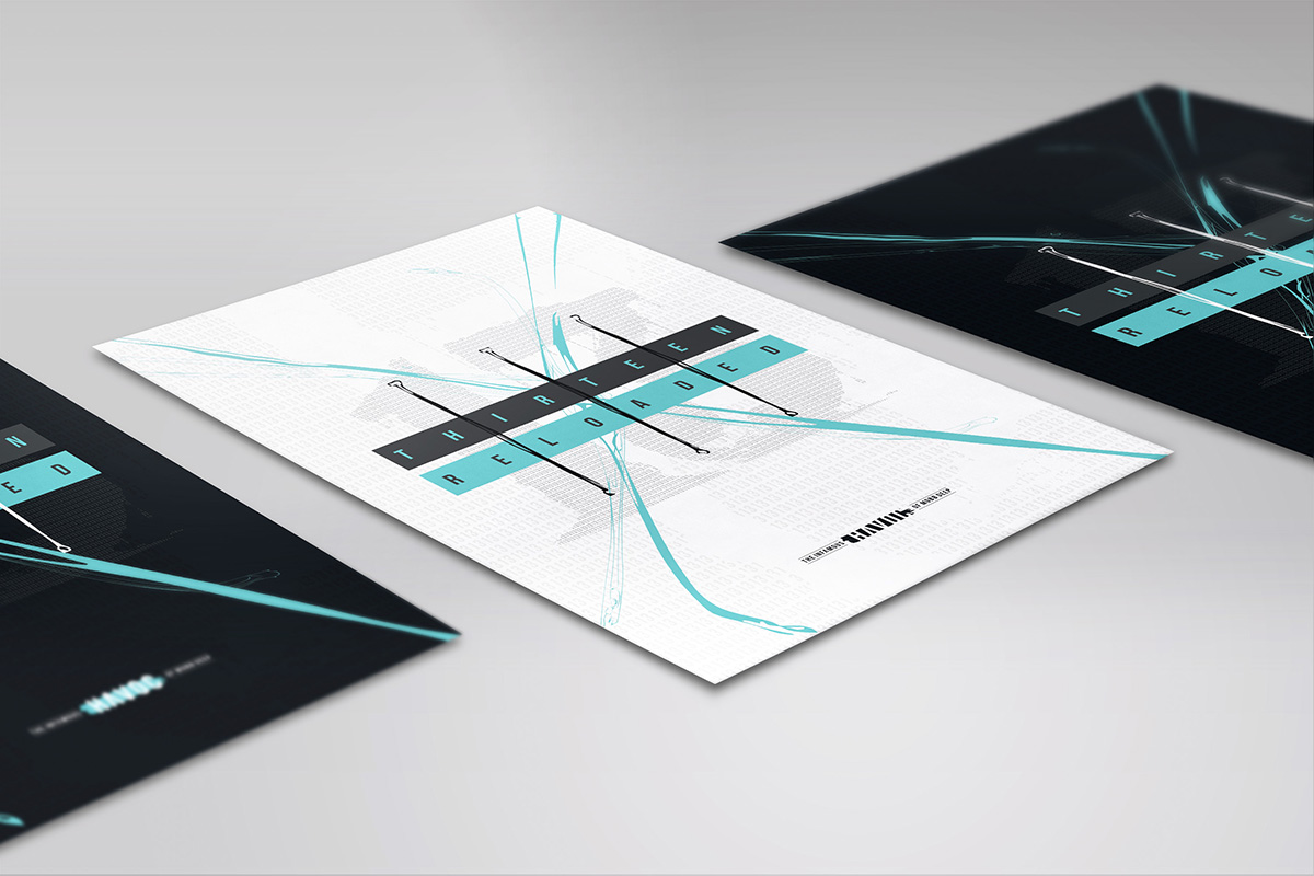
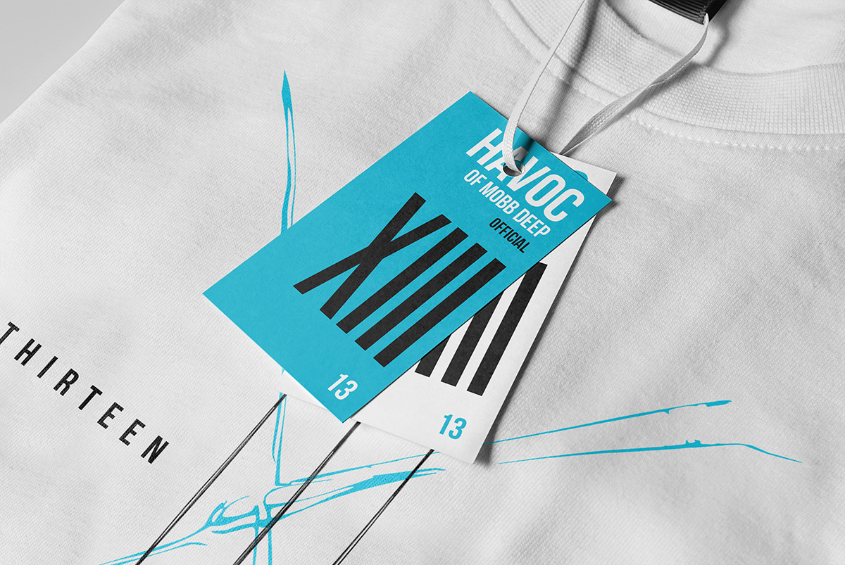
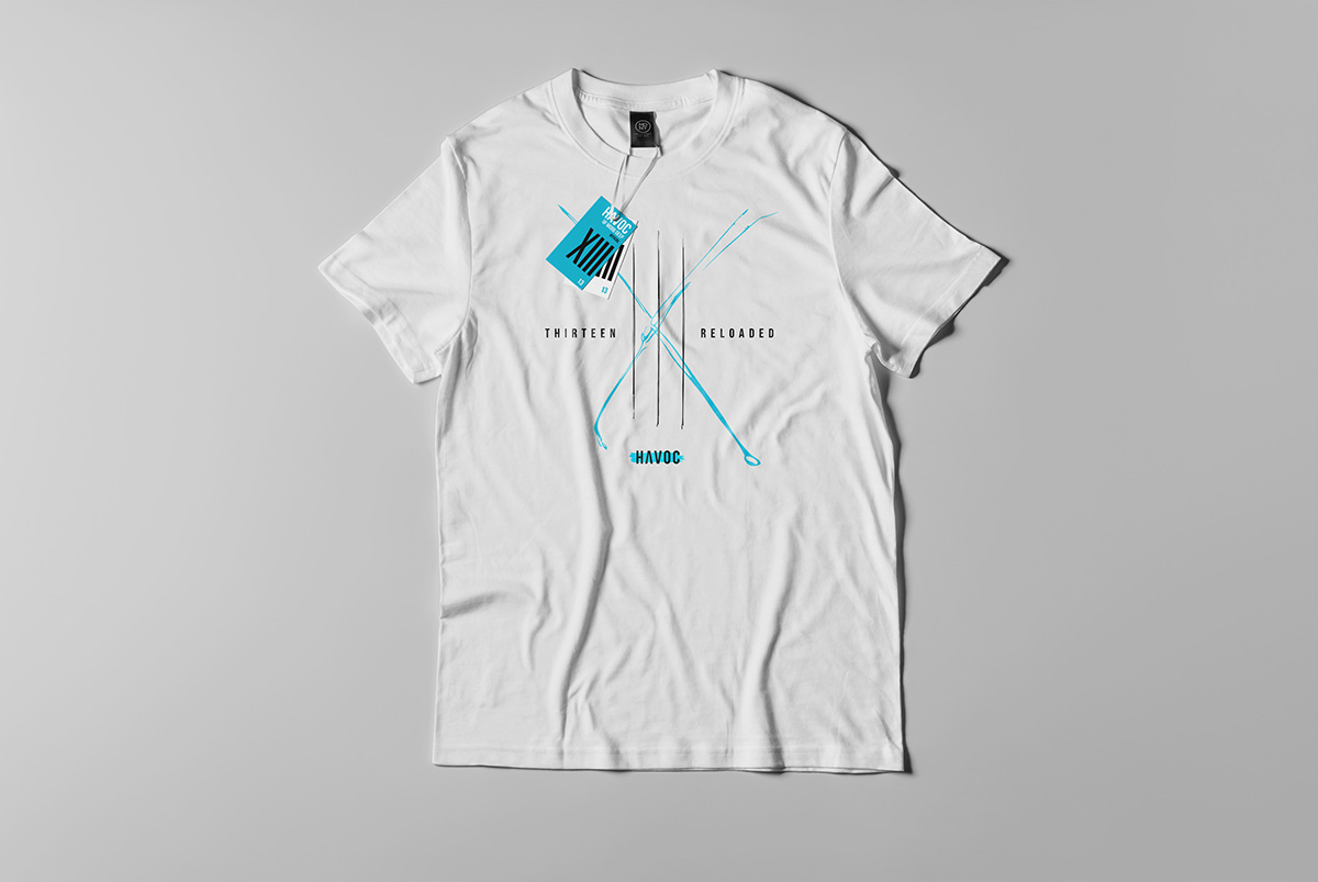
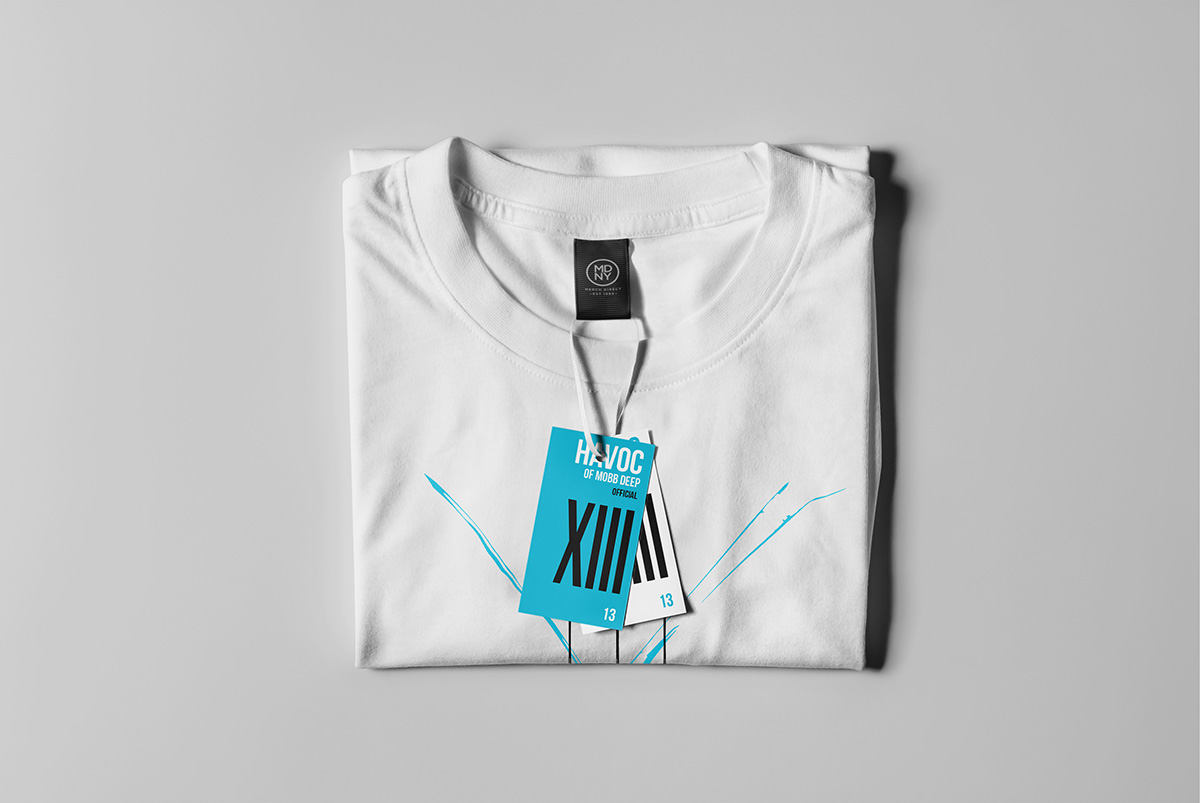
Expanding further to merchandise designs, elevate Havoc’s identity beyond music. Merchandise concept includes minimalist, streetwear-inspired graphics, such as clean typography, album color theme, and nods to Queensbridge, with the album “XIII Reloaded” emblem in the center.
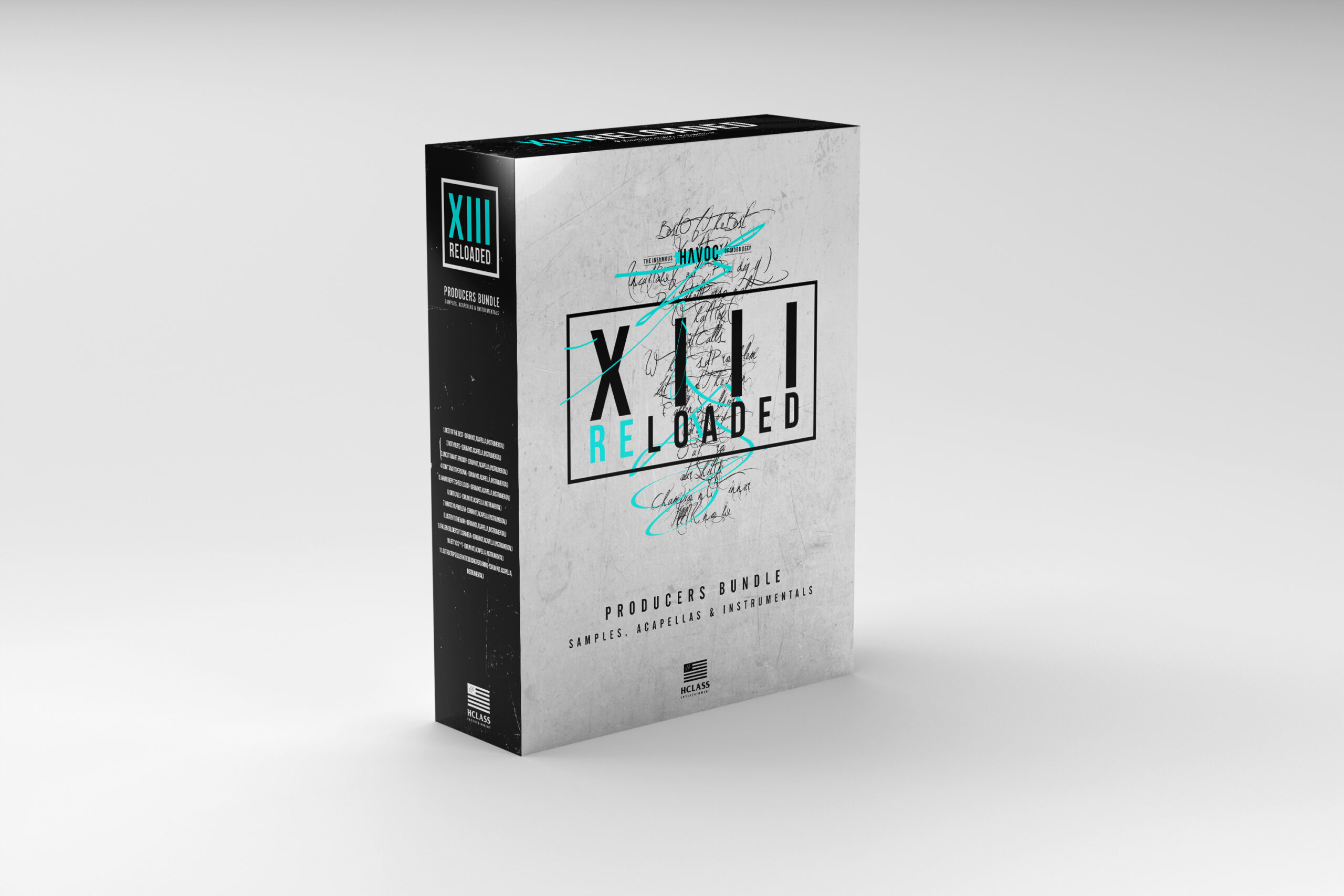
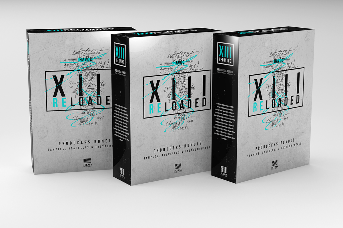
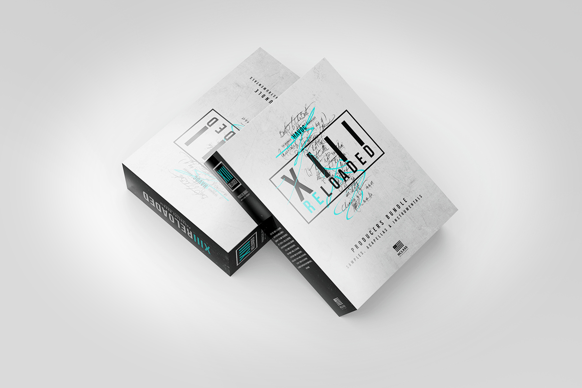
The producer’s bundle — a curated kit of samples and stems — reflects Havoc’s mastery of sound design, housed in sleek packaging inspired by vintage recording equipment. The entire project, ties together Havoc’s legacy with innovative, urban-inspired designs, spotlighting your ability to bridge cultural authenticity and modern aesthetics in creative work.